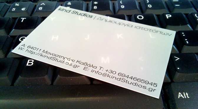
Kind studios busyness card v2

Having reviewed the effect our first spin on a busyness card had, we embarked on one more design journey to express our busyness philosophy through a piece of paper (or vinyl). Watching people's reactions when being presented with the first version of the busyness card we realized that, while it was making a statement as designed, a lot of people felt it had a 'forced' and 'dark' quality to it. That was not intended. It wasn't a deal breaker though so we kept using the cards for some months since the overall criticism was very positive. With the v1 stock nearing it's depletion we made some time and sat down to re-imagine the busyness card of our studios. This is the result. A bright and contrasty piece of plastic. We designed it to be very precise in its message and clear in its impact. Hope you all like it...
